
Exploring “Typical” Values Using Data with Jupyter Notebook
 Students use Jupyter Notebook to explore "typical" valuesCopyright Created by Sun Young Ban and Michelle Wilkerson
Students explore the concept of what is “typical” in a dataset by analyzing measures of center (mean, median) and spread (range, standard deviation) using a Jupyter Notebook. Rather than beginning with formulas, the activity starts with a guiding question: What value best represents a dataset? Students first examine simple data and make intuitive judgments before learning formal definitions. Using Python tools such as NumPy and Pandas, students compute statistical measures and observe how these values change when the data is modified. They then visualize distributions using histograms and boxplots to better understand patterns such as symmetry, skewness, and outliers. The activity extends to real-world housing data, where students analyze home prices and recognize how skewed distributions affect the interpretation of mean and median. Through this process, students connect abstract statistical concepts to practical decision-making.
Engineers and data scientists rely on statistics to make sense of complex, real-world data and make informed decisions about the systems, structures, and technologies they design. Before drawing conclusions or making recommendations, they must determine whether the data accurately represent typical conditions or whether unusual values (outliers) could lead to misleading results. Rather than relying on a single statistic, engineers compare measures such as the mean, median, and standard deviation and use graphical representations, including histograms and box plots, to identify patterns, variability, skewness, and outliers. These skills are essential in applications such as analyzing housing prices, optimizing transportation systems, monitoring environmental conditions, and evaluating engineering designs.
After this activity, students should be able to:
- Distinguish between typical and atypical (outlier) values.
- Use Python (NumPy, Pandas) to analyze datasets.
- Interpret histograms and boxplots to understand data distribution.
- Explain when mean vs. median is more appropriate.
- Apply statistical reasoning to real-world data (housing prices).
- CCSS.Math.Content.HSS-ID.A.1 Represent data with plots on the real number line (dot plots, histograms, and box plots).
Grades 9-12
Do you agree with this alignment? - CCSS.Math.Content.HSS-ID.A.2 Use statistics appropriate to the shape of the data distribution to compare center (median, mean) and spread (interquartile range, standard deviation) of two or more different data sets.
Grades 9-12
Do you agree with this alignment? - CCSS.Math.Content.HSS-ID.A.3 Interpret differences in shape, center, and spread in the context of the data sets, accounting for possible effects of extreme data points (outliers).
Grades 9-12
Do you agree with this alignment? - CCSS.Math.Content.HSS-ID.B.6 Represent data on two quantitative variables on a scatter plot, and describe how the variables are related.
Grades 9-12
Do you agree with this alignment?
- STEL-8Q Synthesize data and analyze trends to make decisions about technological products, systems, or processes.
Grades 9-12
Do you agree with this alignment?
- HS-ETS1-4 Use a computer simulation to model the impact of proposed solutions to a complex real-world problem with numerous criteria and constraints on interactions within and between systems relevant to the problem.
Grades 9-12
This resource focuses on the following Three Dimensional Learning aspects of NGSS:
Science & Engineering Practices- Use mathematical models and/or computer simulations to predict the effects of a design solution on systems and/or the interactions between systems.Do you agree with this alignment?
Disciplinary Core Ideas- Both physical models and computers can be used in various ways to aid in the engineering design process. Computers are useful for a variety of purposes, such as running simulations to test different ways of solving a problem or to see which one is most efficient or economical; and in making a persuasive presentation to a client about how a given design will meet his or her needs.Do you agree with this alignment?
Crosscutting Concepts- Models (e.g., physical, mathematical, computer models) can be used to simulate systems and interactions—including energy, matter, and information flows—within and between systems at different scales.Do you agree with this alignment?
Do you agree with this alignment? - Use mathematical models and/or computer simulations to predict the effects of a design solution on systems and/or the interactions between systems.
Each student (or pair) needs:
- 1 laptop or tablet with internet access (for running Jupyter Notebook) and access to a web browser (e.g., Chrome, Safari, Firefox)
- access to the Jupyter Notebook activity:
https://www.jupytereverywhere.org/lab/index.html?notebook=rational-adaptable-heron - digital dataset (included within the notebook; no separate download required)
- Jupyter Notebook Worksheet (PDF)
- (optional) notebook or scratch paper for notes
- (optional) pen or pencil
For the entire class to share:
- (optional but recommended) projector or screen for instructor demonstration
- instructor computer with internet access
- access to Python libraries (preloaded in the notebook environment):
- NumPy
- Pandas
- Matplotlib
Notes:
- No physical lab materials are required; this is a fully digital activity.
- Knowledge of Python is not required, as guidance is provided.
- No prior installation is needed since the notebook runs in a web-based environment.
- If devices are limited, students can work in pairs or small groups.
Students should:
- Have an introductory understanding of mean and median (informal or prior exposure is sufficient).
- Be comfortable interpreting simple graphs such as bar charts or histograms.
- Have basic computer skills (i.e., running code cells, typing, navigating a browser).
Today, we will explore a question that seems simple but is actually quite complex: What does it mean for something to be “typical”?
Let’s start with a real-world example. Imagine you are looking at home prices in a city. You see values like $300,000, $350,000, $400,000, and $450,000, but then there is one house listed at $2,000,000. At first glance, most of the homes seem to fall within a similar price range, while one house is much more expensive than the rest. This raises an important question: How would you describe a "typical" home price?
Take a moment to think about what you notice. Which value seems unusual? Why? If you had to describe a typical home price, what would you choose? Turn to a partner and briefly discuss your reasoning. (Possible student answers: the $2,000,000 house is much more expensive than the others; most of the homes cost between $300,000 and $450,000; a typical home price is probably around $350,000 or $400,000; the expensive house doesn't seem to represent most of the homes; using the average might make the typical price seem higher than it really is.)
This raises an important question: How do we describe a "typical" value in a dataset? Sometimes the mean (average) is a good measure of what is typical. Other times, an unusually large or small value (called an outlier) can pull the mean away from where most of the data lies. In those situations, the median may provide a better description of a typical value. Determining which measure best represents a dataset is something engineers, scientists, and data analysts do every day when interpreting data and making evidence-based decisions.
In this activity, you will use a Jupyter Notebook to analyze real data, calculate summary statistics, and create graphs that reveal patterns in the data. As you work, think about which measure of center (the mean or the median) best describes a typical value and why. You'll also investigate how outliers and variation can change the story the data tells. By the end of the activity, you will better understand how engineers and data scientists use statistics to analyze information, identify trends, and make informed decisions.
Background (Teacher’s Guide)
This activity helps students understand what it means for a value to be “typical” by exploring measures of center and spread using a computational notebook. Students analyze mean, median, and standard deviation while interpreting visualizations such as histograms and boxplots. Because real-world data (such as housing prices) are often skewed, the activity emphasizes that the mean does not always represent a dataset well. Instead, students compare numerical summaries with graphical displays to make informed decisions. The activity also connects to engineering and data science practices, where professionals analyze data, evaluate variability, and make evidence-based decisions. Students engage in a similar process by exploring data, visualizing patterns, and justifying their reasoning using computational tools.
Descriptive Statistics
Descriptive statistics summarize and describe the characteristics of a dataset. Rather than examining every individual data point, descriptive statistics provide numerical measures that help identify patterns and trends. In this activity, students focus on measures of center and graphical representations to determine what constitutes a "typical" value.
Mean
The mean (average) is calculated by adding all values in a dataset and dividing by the total number of values. The mean uses every data point, making it a useful measure of center when data are distributed fairly evenly. However, because it incorporates every value, the mean is sensitive to unusually large or small observations (outliers).
Median
The median is the middle value when data are arranged from smallest to largest. If there is an even number of values, the median is the average of the two middle values. Unlike the mean, the median is resistant to outliers and often provides a better measure of the center of skewed datasets.
Outliers
An outlier is a value that is much larger or much smaller than most other observations in a dataset. Outliers may result from natural variation, rare events, or measurement errors. Because outliers can substantially affect the mean while having little effect on the median, identifying them is an important step in data analysis.
Distribution and Variability
A dataset's distribution describes how values are spread across the range of observations. Distributions may be symmetric or skewed, and they may contain clusters, gaps, or outliers. Variability refers to how spread out the data are. Understanding both the center and the spread of a dataset allows students to make more informed interpretations.
Histograms and Box Plots
Students use two common graphical tools to visualize data:
- Histograms group data into intervals (bins) to show the overall shape of a distribution, including skewness and clusters.
- Box plots summarize a dataset using the median, quartiles, and potential outliers, making them useful for comparing distributions and identifying unusual values.
Why Engineers Use Statistics
Engineers and data scientists routinely collect and analyze data to make evidence-based decisions. They use measures such as the mean and median to summarize data, identify trends, evaluate system performance, and communicate results. Choosing the appropriate statistical measure is important because different datasets may require different approaches. For example, environmental engineers may analyze air quality measurements, civil engineers may evaluate traffic speeds, and biomedical engineers may examine patient health data. Recognizing when outliers influence results helps engineers make more accurate and reliable decisions.
Jupyter Notebook
A Jupyter Notebook is an interactive computing environment that combines executable code, text, equations, and visualizations in a single document. In this activity, students use a pre-built notebook to calculate descriptive statistics and generate graphs. You do not need programming experience to facilitate the activity, as students primarily execute provided code cells and interpret the resulting outputs.
Before the Activity
- Review and test the Jupyter Notebook to ensure all code runs properly.
- Ensure student devices have internet access.
- Upload or confirm access to the dataset (e.g., housing data): https://www.jupytereverywhere.org/lab/index.html?notebook=rational-adaptable-heron.
- Make copies of the Jupyter Notebook Worksheet (PDF) (1 per student).
- Review key concepts such as mean, median, variability, and outliers.
- Set up a projector or screen for a whole-class demonstration.
- Organize students into pairs or small groups (if applicable).
During the Activity (60 minutes)
Introduce the concept of a typical value
- Begin by asking students what it means for a value to be "typical." Display the following home prices on the board or screen: $300,000, $350,000, $400,000, $450,000, and $2,000,000.
- Pre-Activity Assessment: Ask the students:
- What do you notice about these home prices? (Possible answers: Most of the homes cost between $300,000 and $450,000; one home is much more expensive than the others.)
- Which value seems unusual? Why? (Possible answer: The $2,000,000 home is much higher than the others and appears to be an outlier.)
- If you had to describe a "typical" home price, what would you choose? (Possible answers: Around $350,000 or $400,000 because most of the homes are close to those values.)
- Do you think the average always represents what is typical? Why or why not? (Possible answers: Yes, because it uses all the values; no, because one unusually large value can pull the average away from where most of the data lies.)
- Allow students two to three minutes to discuss their ideas with a partner.
- Facilitate a brief whole-class discussion, asking several students to share their reasoning.
- Explain that engineers, scientists, and data analysts often use statistics to describe what is "typical," but the most appropriate measure depends on the characteristics of the dataset. Tell students that to make these decisions, they use statistical measures such as the mean, median, and standard deviation, along with information about the variability of the data.
- Describe the challenge: Students will use a Jupyter Notebook to investigate when the mean or the median provides a better representation of a typical value by analyzing real-world data, calculating summary statistics, and interpreting graphs.
Review key statistical concepts
- Briefly review key concepts such as the mean, median, standard deviation, outliers, and variability.
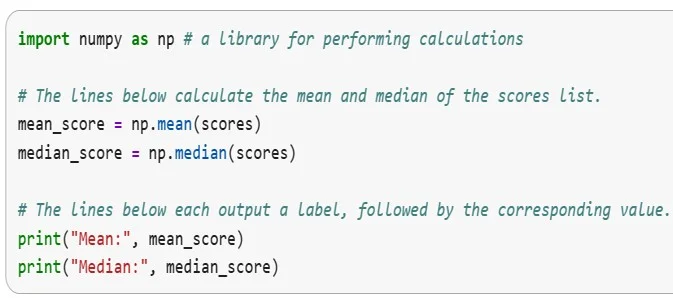
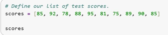 Looking at these values, what score seems typical? Which scores feel common? Which scores seem unusually low or high? Would everyone in the room choose the same “typical” value? What value seems most “typical” in this dataset, and why might different people choose different answers?Copyright Created by Sun Young Ban and Michelle WilkersonWhich value seems more representative of this class? Why are the mean and median close here? If one student scored a 20, what would happen to the mean? What about the median? Which measure would you trust more if a dataset had outliers? How do the mean and median describe what is “typical,” and how are they affected by extreme values?Copyright Created by Sun Young Ban and Michelle Wilkerson
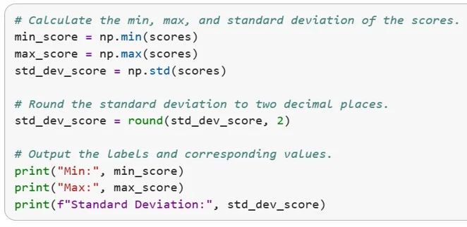 If all scores were almost the same, would the standard deviation be large or small? Can a dataset have a moderate mean but still be highly spread out? Is the maximum score enough to tell us how the class performed overall? What kind of score would feel “atypical” here?Copyright Created by Sun Young Ban and Michelle Wilkerson
- Emphasize that the mean uses every value in the dataset and can be influenced by unusually high or low values, while the median is less affected by outliers.
- Remind students that standard deviation measures how spread out the data are, while variability describes the overall spread of the dataset.
- Explain that graphs such as histograms and box plots help reveal patterns, including the shape of the distribution, skewness, and outliers, that may not be apparent from summary statistics alone.
Demonstrate the Jupyter Notebook
- Introduce the Jupyter Notebook students will use throughout the activity. Demonstrate how to:
- Open the notebook.
- Run individual code cells.
- Execute the provided code to calculate summary statistics and generate graphs: https://www.jupytereverywhere.org/lab/index.html?notebook=rational-adaptable-heron
- View calculated statistics.
- Interpret tables and graphical outputs.
- Explain that students will not be writing code during this activity. Instead, they will execute the provided code cells and focus on analyzing, interpreting, and drawing conclusions from the results.
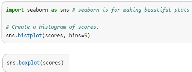 Does the histogram look roughly symmetric or skewed? Where do most of the scores cluster? Does the mean seem to sit near the center of the graph? What does the boxplot show more clearly than the histogram? What does the histogram show more clearly than the boxplot? how are they affected by extreme values?Copyright Created by Sun Young Ban and Michelle Wilkerson
Part 1: Prediction
- Distribute one Jupyter Notebook Worksheet (PDF) to each student.
- Explain that students are to record their summary statistics, observations, and responses to discussion questions in their Jupyter Notebook Worksheet (PDF)throughout the activity.
- Ask students to predict whether the mean and median will be similar or different.
- Have students record their predictions and justify their predictions using evidence from the introductory discussion in Part 1 of the Jupyter Notebook Worksheet (PDF).
- Encourage students to think about whether they expect the dataset to contain outliers or be evenly distributed.
Part 2: Data Exploration
- Direct students to load the dataset in the Jupyter Notebook and execute the appropriate code cells.
- Have students calculate the mean, median, standard deviation, minimum, maximum, and other provided summary statistics.
- Activity-Embedded (Formative) Assessment: Pause the activity and ask students to complete a Think-Pair-Share with the following questions
- What do you notice about the relationship between the mean and the median?
- Are they similar or different? Why do you think that is?
- Circulate around the room, listen to student discussions, and ask follow-up questions to assess student understanding. Encourage students to support their explanations using the summary statistics they calculated.
- Ask students to note their results and compare the measures of center (mean and median) and variability (standard deviation) in Part 2 of their Jupyter Notebook Worksheet (PDF).
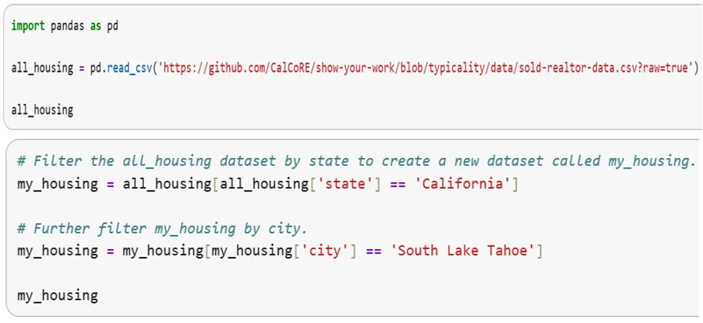 Why do we filter by both state and city? What could go wrong if we filtered only by city name? What do you notice about the table preview? Before calculating anything, what do you predict about home prices in this city?Copyright Created by Sun Young Ban and Michelle Wilkerson
Part 3: Graph Interpretation
- Guide students through creating a histogram and box plot using the notebook.
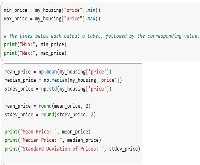 Why might the mean be higher than the median here? Would the mean represent a “typical” buyer experience? How do outliers affect housing data differently than they affect quiz scores? If a city has a few luxury homes, what happens to the mean?Copyright Created by Sun Young Ban and Michelle Wilkerson
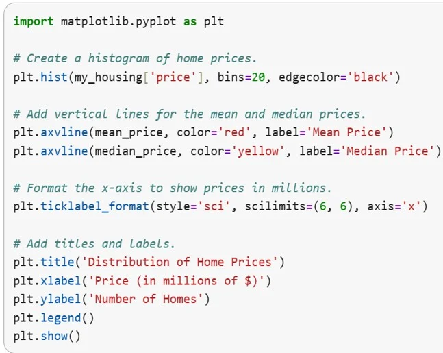 What does the long right tail suggest? Which measure, mean or median, better captures a typical home price? If someone said “homes in this city usually cost the mean price,” would that be misleading? What do the plots reveal that the summary numbers alone cannot?Copyright Created by Sun Young Ban and Michelle Wilkerson
- Ask students to examine the graphs and discuss the following questions:
- What is the overall shape of the distribution?
- Does the data appear symmetric or skewed?
- Are there any potential outliers?
- Does the graphical evidence support your prediction about the mean and median?
- What does the shape of the graph tell you about the data?
- Circulate and ask probing questions to assess students' interpretations.
- Which graph best helps you understand the data?
- How do the graphs support your choice of mean or median?
- Have students answer the questions in Part 3 of their Jupyter Notebook Worksheet (PDF).
Part 4: Reasoning
- Ask students to determine whether the mean or the median better represents a "typical" value for the dataset.
- Require students to justify their choice using both the numerical summary statistics and the graphical evidence from the histogram and box plot.
- Encourage students to explain how outliers or skewness influenced their decision.
- Have students complete a brief written response in Part 4 of their worksheet:
- Which measure (mean or median) better represents a typical value for this dataset?
- Explain your answer using evidence from both the summary statistics and the graphs.
- Review student responses to assess their ability to justify conclusions using numerical and graphical evidence.
Explore and test ideas
- Have students investigate how changes to the dataset affect the statistical measures. For example, students may remove an outlier, add additional values, or analyze subsets of the data.
- After each modification, have students recalculate the summary statistics and recreate the graphs.
- Ask students to compare the new results with the original dataset and identify which measures changed the most, and why.
Part 5: Reflection
- Have students complete Part 5 of their Jupyter Notebook Worksheet (PDF).
- Conclude with a whole-class discussion.
- Ask students to share their findings and explain which measure of center they believe best represented the dataset.
- Guide students in connecting their observations to real-world engineering and data science applications by discussing how professionals analyze data, identify patterns, evaluate variability, and make evidence-based decisions.
- Emphasize that selecting the appropriate statistical measure depends on the characteristics of the data and the question being asked.
- Post-Activity (Summative) Assessment: Distribute an exit ticket or have students respond in their notebooks:
- How do the mean, median, and graphs work together to help you decide what is "typical" in a dataset?
- mean
- The average value of a dataset, calculated by adding all values and dividing by the total number of values.
- median
- The middle value in an ordered dataset; if there is an even number of values, it is the average of the two middle numbers.
- standard deviation
- A measure of how spread out the data values are from the mean; it indicates the amount of variability in a dataset.
- range
- The difference between the largest and smallest values in a dataset.
- distribution
- The way data values are spread or arranged across possible values, often shown using graphs such as histograms.
- outlier
- A data point that is significantly higher or lower than the rest of the data.
- skewness
- The degree to which a distribution is not symmetrical; data can be skewed left or right.
- histogram
- A graph that displays the frequency of data values grouped into intervals (bins).
- boxplot
- A graphical display that summarizes a dataset using quartiles and highlights the spread and potential outliers.
- dataset
- A collection of related data values used for analysis.
- variability
- The extent to which data values differ from each other or from the mean.
- typical value
- A value that represents the center or common tendency of a dataset, often described using mean or median.
Pre-Activity Assessment
Quick Discussion / Prediction Prompt: Before beginning the activity, ask students: “If you were trying to describe a ‘typical’ house price, would you use the average (mean) or the middle value (median)? Why?” Facilitate a short whole-class discussion and record a few student responses on the board. This helps identify prior knowledge and common misconceptions about mean vs. median.
Activity Embedded (Formative) Assessment
Guided Notebook Check / Think-Pair-Share:
As students work through the Jupyter Notebook, pause at key points (after computing statistics and after creating graphs) and asks students to discuss with a partner:
- “What do you notice about the relationship between the mean and median?”
- “What does the shape of the graph tell you about the data?”
Circulate, listen to discussions, and ask follow-up questions to check for understanding.
Short Written Check (Worksheet or Notebook Entry): Students write a brief explanation: “Which measure (mean or median) better represents a typical value for this dataset? Explain using evidence from the graph.” This allows you to quickly assess whether students can connect numerical and visual information.
Post-Activity (Summative) Assessment
Exit Ticket / Reflection Question: At the end of the activity, students respond individually to: “How do mean, median, and graphs work together to help you decide what is ‘typical’ in a dataset?” Collect responses to evaluate student understanding of both concepts and reasoning.
During this activity, students may encounter both technical and conceptual challenges as they work within the Jupyter Notebook environment. Anticipating these common issues will help ensure a smoother learning experience:
- If the notebook does not load properly, have students refresh the page or switch to a different browser (Chrome is recommended).
- If students are unsure how to run code, remind them to click inside a cell and press Shift + Enter.
- If graphs or outputs do not appear, ask students to rerun the cell or restart the notebook session.
- Some students may focus on executing code rather than interpreting results. Pause the activity and ask guiding questions such as: “What does this result tell us?” or “How does this relate to what is typical?”
- Students often confuse mean and median. Encourage them to modify the dataset by adding an extreme value and observe how each measure changes.
- When working with skewed data, reinforce understanding by comparing numerical results with visual graphs such as histograms and boxplots.
- If students obtain unexpected results, have them verify that they executed the code cells in order before continuing with the activity.
- Analyze student-collected data (e.g., surveys, real-world data).
- Compare datasets from different contexts (e.g., housing in different cities).
- Explore the impact of outliers.
- Create and interpret additional visualizations.
- Apply results to decision-making scenarios.
- Modify the notebook to explore new variables or datasets.
- For lower-level students: Provide partial code, focus on interpretation, use simpler datasets, and emphasize graphs
- For advanced students: Have students write/modify code, explore additional measures (e.g., IQR), compare datasets, and justify conclusions
Contributors
Sun Young Ban, Math Instructor, Merritt College Michelle Hoda Wilkerson, Associate Professor, Berkeley School of Education
Supporting Program
Computing, Reasoning, and Expression (CoRE) Lab at UC Berkeley
Acknowledgements
CalTeach BERET: This curriculum was developed as part of the CoRE Lab and CalTeach BERET programs, focused on integrating computational thinking into STEM education.
This curriculum was developed under National Science Foundation RET grant number #2419242. Any opinions, findings, and conclusions or recommendations expressed in this material are those of the authors and do not necessarily reflect the views of the National Science Foundation.
Copyright
2026 by Regents of the University of Colorado; original © 2025 UC Berkeley