
Heat Flow and Diagrams Lab
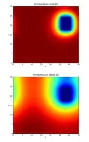 These thermal imager graphics are a good example of how some information is easier to show visually than to describe in words or numbers.Copyright 2010 Bertaklerta, Wikimedia Commons http://commons.wikimedia.org/wiki/File:Heat_diffusion.png
Students' eyes are opened to the value of creative, expressive and succinct visual presentation of data, findings and concepts. Student pairs design, redesign and perform simple experiments to test the differences in thermal conductivity (heat flow) through different media (foil and thin steel). Then students create visual diagrams of their findings that can be understood by anyone with little background on the subject, applying their newly learned art vocabulary and concepts to clearly communicate their results. The principles of visual design include contrast, alignment, repetition and proximity; the elements of visual design include an awareness of the use of lines, color, texture, shape, size, value and space. If students already have data available from other experiments, have them jump right into the diagram creation and critique portions of the activity.
One important skill for scientists and engineers is to be able to clearly explain and demonstrate their findings. Everything from promotions, to funding, to submitting publications requires easy-to-follow explanations. While equations and writing are two main techniques, use of the visual arts can often be more effective at describing phenomena. Diagrams, 3D modeling, short animations, schematics and graphs can all be effective ways to explain a lot of data quickly and clearly.
After this activity, students should be able to:
- Design and perform an experiment.
- Evaluate the accuracy of their data and determine how to improve it.
- Construct a visual model to represent their data.
- Control experiment variables in order to determine correlation.
- Apply the engineering design process.
- CCSS.Math.Content.HSN-Q.A.2 Define appropriate quantities for the purpose of descriptive modeling.
Grades 9-12
Do you agree with this alignment? - CCSS.Math.Content.HSN-Q.A.3 Choose a level of accuracy appropriate to limitations on measurement when reporting quantities.
Grades 9-12
Do you agree with this alignment? - CCSS.Math.Content.HSS-ID.B Summarize, represent, and interpret data on two categorical and quantitative variables
Grades 9-12
Do you agree with this alignment? - CCSS.Math.Practice.MP5 Use appropriate tools strategically.
Grades K-12
Do you agree with this alignment?
- SCSh8.a Scientific investigators control the conditions of their experiments in order to produce valuable data.
Grades 9-12
Do you agree with this alignment? - SCSh8.b Scientific researchers are expected to critically assess the quality of data including possible sources of bias in their investigations' hypotheses, observations, data analyses, and interpretations.
Grades 9-12
Do you agree with this alignment? - SCSh8.c Scientists use practices such as peer review and publication to reinforce the integrity of scientific activity and reporting.
Grades 9-12
Do you agree with this alignment? - SCSh8.d The merit of a new theory is judged by how well scientific data are explained by the new theory.
Grades 9-12
Do you agree with this alignment?
- Students will develop an understanding of the attributes of design.
Grades K-12
Do you agree with this alignment? - Students will develop an understanding of engineering design.
Grades K-12
Do you agree with this alignment? - A prototype is a working model used to test a design concept by making actual observations and necessary adjustments.
Grades 9-12
Do you agree with this alignment? - STEL-7AA Illustrate principles, elements, and factors of design.
Grades 9-12
Do you agree with this alignment? - STEL-7CC Apply a broad range of design skills to their design process.
Grades 9-12
Do you agree with this alignment? - STEL-7W Determine the best approach by evaluating the purpose of the design.
Grades 9-12
Do you agree with this alignment?
- HS-ETS1-2 Design a solution to a complex real-world problem by breaking it down into smaller, more manageable problems that can be solved through engineering.
Grades 9-12
This resource focuses on the following Three Dimensional Learning aspects of NGSS:
Science & Engineering Practices- Design a solution to a complex real-world problem, based on scientific knowledge, student-generated sources of evidence, prioritized criteria, and tradeoff considerations.Do you agree with this alignment?
Disciplinary Core Ideas- Criteria may need to be broken down into simpler ones that can be approached systematically, and decisions about the priority of certain criteria over others (trade-offs) may be needed.Do you agree with this alignment?
Do you agree with this alignment? - Design a solution to a complex real-world problem, based on scientific knowledge, student-generated sources of evidence, prioritized criteria, and tradeoff considerations.
Each group needs:
- 1 sheet of paper
- art supplies such as markers, colored pencils, paint, scissors, construction paper, glue; help students be creative by giving them several options of visual art supplies to use in making their diagrams
- 1 sheet of aluminum foil
- 1 sheet stainless steel shim stock of .025 mm (.001 inch) thickness, such 10 sheets from grainger.com; see note below
- meter stick
- stopwatch
- thermocouple, such as the Digi-Sense Calibrated Remote-Monitoring Thermocouple at Cole-Parmer.com
- Principles and Elements of Design Handout (PDF) one per person; students should already have this as a handout from the associated lesson
- Diagram Grading Rubric (PDF) one per person
To share with the entire class:
- TEC heater, such as the TEC3-6 Element from https://www.thorlabs.us/index.cfm; see its web page with assorted small heaters at reasonable prices; see note below
- thermal paste; Cooler Master is a common brand, for example Cooler Master Thermal Compound at Amazon
- C cell batteries
- (optional) battery holders, to prevent the likelihood of shocks.
Note about heaters: The type of heater to use is largely dependent on your budget. Look for RTD and thermistors, with the main idea to look for high thermal conductivity and small size, and that it reaches temperatures of ~100 °F. Also, it must be about a 3:1 ratio of the size of the metal sheet to the size of the heater. Any larger and the metal gives off the heat to the air before it heats up.
Note about metal sheets: For the metal sheets, any two different materials (such as the suggested foil and steel) will work, but choose materials that have large differences in thermal conductivity, at least 100 W/mk, which can be found by searching for "thermal conductivity of common materials" in a search engine. They also need to be small in size; otherwise they serve as a heat spreader and never rise high enough in temperature for students to measure. For this lab, aluminum foil and steel shim stock of approximately equal thicknesses work well.
Students should have completed the associated lesson to attain background information about the value of good visual communication, the principles and elements of visual design and the real-world research funding process.
Students should have had basic introduction to the engineering design process, which they apply in the activity to design their labs. Learn more at https://www.teachengineering.org/k12engineering/designprocess.
This activity requires no formal prior knowledge on thermodynamics; students should be able to draw on their lifetimes of everyday heating/cooling experiences (with refrigerators, ovens, space heaters, drinking glass condensation, etc.) in order to draw conclusions.
Art and communication are two topics that go hand-in-hand in STEM fields. Flip through any textbook, newspaper, technology magazine or article and you will likely find many visual images being used to show information, concepts and ideas. Some are focused on grabbing your attention or bringing to light something you may not have noticed. But many are used to communicate data and help people understand in ways that equations, data tables and long explanations often do not do as effectively.
This idea is not only true for educational purposes, but also for scientists and engineers in their efforts to get research and start-up funding. Grants are the source of most funding for scientific and engineering research and activities and, in order to get those funds, the proposing team must be able to communicate its ideas clearly. The reviewing people deciding who get the funds may not be experts in the specific field and only know the basics. If the engineering team does not communicate information at a level that can be easily understood by the reviewers, their projects may be deemed too complicated or risky, or just not understood, and funds may be awarded to other projects.
Overview
The point of this activity is to get students to make educated hypotheses, control their variables, design experiments and communicate their findings in a clear way. Students should have handy a list of art vocabulary words and their definitions (in the form of the handout provided to them in the associated lesson) so that they are able to communicate what they see and what they are trying to do. This activity is an experiment that does not require students to have any formal prior knowledge on thermodynamics, expect them to be able to draw on past experiences (with refrigerators, condensation on glasses, space heaters, etc.) in order to draw conclusions.
Start by having student pairs design (and refine) experimental labs that test the differences in heat flow through different materials (aluminum foil and steel shim stock). These materials give clear differences and data result that are difficult for students to misinterpret. If you have time, let students explore other variables or give them very little guidance and let them make mistakes so they can go through the entire design process a few times. Students tend to retain more information if the teacher gives them more control so what they learn becomes something discovered rather than what the book said.
Working with their own data as if they are scientific or engineering researchers gives students the opportunity to practice creating diagrams that communicate their findings by applying the fundamental art vocabulary and examples of methods used in art. Encourage students to use the correct terms to describe, discuss and improve their diagrams and those of their classmates. Refer to the associated lesson for more information about art and design concepts, the research funding process, and heat flow.
Before the Activity
Gather materials and make copies of the Diagram Grading Rubric (PDF), one per student. Students should already have the Principles and Elements of Design Handout (PDF) from the associated lesson, but make additional copies if needed.
With the Students
- Review with students the steps of the engineering design process. Make sure they know that it is a cyclical process that can be repeated over and over to improve a design or find an optimal solution to a problem.
- Discuss lab safety and make sure students understand what is and is not permitted in a lab environment.
- Divide the class into groups of two students each. Groups with more than three students are problematic because there is little for the additional students to do.
- Start a conversation by asking students what they know about thermal conductivity, if anything. Describe numerous everyday scenarios, such as ice in a glass, a space heater in a room, etc., and ask them to name some variables upon which they think heat transfer depends.
- Write all student-suggested variables on the classroom board. Then go through each one, asking students how they would test the variable in a lab environment. The correct variables include material thickness, material type (that is, paper, aluminum, wood, etc.), contact surface area and temperature difference. If time permits, widen the experiment scope to include other variables and go through lab designs for those as well. Guide students to draw the conclusion that different materials conduct heat differently (aluminum vs. shim stock). Help students design experiments to test how they will measure each variable that affects heat transfer. A good example is to place the heater in the center of the material and measure temperature at equal intervals of 5 cm at equal times (5 seconds) on both aluminum and shim stock. Students may struggle to figure out that they need to let the material cool down between measurements to get temperatures that are at the same times (that is the temperature at 5 cm, 10 cm, 15 cm and 20 cm from the heater at t = 5 s).
- After the discussion, bring out the lab equipment for students to use. Explain that the heater is a form of resistor that uses a C cell battery to provide heat of ~100 °F. Show students that condensation forms on one side of the heater. This is the cold side of the heater and is part of how it generates its heat. Use thermal paste to glue the heater into place and make good contact, but be cautious because it still permits the heater to slide. The thermocouple works like a typical thermometer; it only needs to come into contact with the surface at a point. However, it can be affected by nearby heating/cooling sources, such as HVAC air vents, which can lead to errors. Explain the equipment and how to use it. Also explain the use of the thermocouple and safety procedures. Have students then set up the design that was discussed and agreed upon in the previous step for measuring how fast heat flows through two different materials (aluminum and steel in this example).
- Give students time to form ideas about the best ways to measure the heat from one point to another. Guide them through measuring the different distances at different time intervals as well as how to record their findings as described in the variable discussion and in the embedded assessment questions (see the Assessment section). If time permits, let students discover this through trial and error, which tends to cultivate student ownership of the content, although it is very time consuming.
- After student teams have collected data, provide them with art supplies and time to come up with their own diagrams to show the heat flow at the different time intervals. Require students to work individually, include a key, and strive for diagrams that are clear and easy to understand. See Figure 1 for two examples of student work; the one on the right was stopped due to time constraints.
- Remind students of some of the images they saw earlier and some of the techniques already discussed.
- Expect some students to make diagrams that are time consuming and difficult to understand at all. Let students make some progress and then show them some examples they have already seen in their textbooks. Ask them to compare what they have done to the examples and try to guide them to something more manageable.
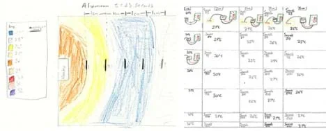 Figure 1. (left) A good example of a successful diagram. A key is provided, color choices are clear, labels indicate what was measured and where. It could be neater wither smoother transitional lines between temperatures, but overall it is effective. (right) This student made clear color choices but struggled with time management and focused too much on the setup rather than the data. Providing just one example drawing of the setup would better summarize it for the viewer.Copyright 2014 Andrew Carnes, Georgia Institute of Technology
- After all students have completed their diagrams, collect and post them in random order so students do not know one from the other. Two examples are provided in Figure 1 with possible critiques for each provided in the caption. Without calling out any individual student, point out pros and cons of each diagram as you conduct a design review.
- Use and encourage students to use the arts vocabulary words regularly so it becomes more natural for them to explain what they see.
- If students are mature enough, have them also provide constructive criticism. In order to offer suggestions and help creative juices flow without judgement, suggest students provide critiques in the form of two "I likes" and one "I wish" or "what if" when commenting on the diagrams.
- If you cannot find both something good and bad with a diagram, skip it entirely unless it has some aspect that you really want to praise or that students should never do.
- After the pros and cons have been pointed out, have the class develop a list of requirements for all diagrams that they will create next to represent (or explain) heat flow. List these clearly and let students know that this becomes the "class key" to which all will be assessed.
- Direct students to create their own diagrams using what the class has determined to be the diagram design requirements and turn them in for grading the following day. Grade students' diagrams on clarity, adherence to the class key, neatness and timeliness, as delineated on the grading rubric.
- Conclude with summary assessment activities provided in the associated lesson write-up—lab data evaluation and lab write-up homework—and its Lesson Closure.
- alignment
- How visually connected elements of an image are. If every element is visually connected then nothing feels out of place or disjointed. Creates a sense of balance.
- chip cap
- A thick material, usually metal, that spreads out the heat given off by a computer chip.
- color
- An element of art derived from reflected light. Color has hue, value and intensity.
- contrast
- The difference in values, colors, textures, shapes and other elements. Contrast creates visual excitement.
- heat flow rate
- The rate at which thermal energy is transferred from one location to another, either from one material to another, or from a hot end to a cold end of the same material.
- heat sink
- A device that absorbs large quantities of heat and distributes this heat into the air or surrounding medium.
- heat spreader
- Another term for chip cap. Some devices use a heat spreader and then a separate attachment for the fins, unlike a chip cap, which is one unit.
- line
- The path of a moving point in space. A line provides something for the eye to follow and can create movement.
- proximity
- How close one object is to another. Can create depth of field or give an appearance that one object is larger or smaller than expected.
- repetition
- Recreation of the same or similar elements in a visual art piece. Creates cohesiveness in an image when a pattern is repeated multiple times.
- shape
- A two-dimensional area that is defined in some way. Geometric shapes look human-made and organic shapes are more free form.
- size
- How large or small an object is. Can be used to create focus and give the illusion of depth.
- texture
- In art, the visual and tactile quality of a surface resulting from the way in which the materials are used. The imitation of the tactile quality of represented objects.
- thermal interface material
- A material with a high thermal conductivity (k value), usually a paste or adhesive (sometimes a film or pad), that increases surface area between two points of contact by filling in all gaps between the two surfaces, thereby increasing heat flow.
- value
- In terms of color, the darkness or lightness of an object or color.
Pre-Activity Assessment
Discussion Questions: Assess students' prior knowledge of thermodynamics with the following questions. Use everyday examples to help illustrate points, such as ice in a glass, an open refrigerator, an open oven door.
- Does heat flow from hot to cold or cold to hot? (Answer: Hot to cold.)
- How fast does heat flow? (Acceptable answers: Quickly, fast, depends on the material[s].)
- What kind of things do you think affect heat flow? (Answer: Material thickness, material thermal coefficient [material type], contact surface area, temperature difference.)
- Does an object get hot all at once or does the heat spread slowly from one place to another? (Answer: Heat spreads gradually from the heat source to the colder ends of the object.)
Activity Embedded Assessment
Guided Lab Questions: Observe student groups and ask questions to guide their experiment evolutions. Ask questions to get them to think about their lab designs and how they affect the data. If time permits, let them make mistakes on their lab designs to serve as teaching moments for these types of questions as well. A few example questions:
- Is it better to measure from one location or several?
- Do you need to worry about time?
- Should the heater be in the center, on the edge, the bottom, the top?
- How are you going to keep your measurements consistent?
- How can you reduce human error in the data?
Post-Activity Assessment
Final Diagram Grading: Using what the class determines to be the diagram design requirements, direct students to create their own diagrams to represent (or explain) heat flow, and turn them in for grading the following day. Review students' diagrams for clarity, adherence to the class key, neatness and timeliness, as delineated on the Diagram Grading Rubric (PDF). Then conclude with summary assessment described in the associated lesson write-up—lab data evaluation and lab write-up homework.
- Use battery holders to prevent the likelihood of shocks.
- Do not touch the heater while it is being operated and let it cool before handling it.
- If possible, keep the heating/cooling air circulation off in the room or make sure the experiments are located away from any vents. Thermocouples can be very sensitive and skew experiment data if they sense nearby chilled or heated air flow.
- Students often struggle with this type of activity if it is their first time with inquiry-based learning. Encourage them that mistakes are commonplace and expected as part of the learning process. Remind them of the refinement step in the design process and that you can skip steps and start again if you foresee a problem.
- If time permits, let students test other variables such as thickness or temperature differences. However, be aware that this is time consuming.
Have students repeat the experiment, but study a different variable.
Have students do mathematical models instead of pictorial models and compare which is most useful for what times.
- For lower grades, rather than doing an open-inquiry lab, make it a structured lab. Give students specific instructions and setup. This is much faster and still enables you to get the key points across and focus on giving students practice in creating effective diagrams.
- For upper grades, have groups make informal presentations to explain their setups and data using their visual diagrams. This gives students practice communicating technical data and speaking to an audience.
A website that focuses on arts integration research, Harvard's Project Zero: https://pz.harvard.edu/.
- Visual Art and Writing in Science and Engineering
- Heat Flow and Diagrams Lab
Contributors
Andrew Carnes; Satish Kumar; Jamila Cola; Baratunde Cola; ARTSNow; PRIME 2014 Fellows
Supporting Program
Partnerships for Research, Innovation and Multi-Scale Engineering (PRIME) RET, Georgia Tech
Acknowledgements
This activity was developed by the Partnerships for Research, Innovation and Multi-Scale Engineering (PRIME) Research Experience for Teachers (RET) Program at Georgia Institute of Technology, funded by National Science Foundation RET grant no. EEC 140718. However, these contents do not necessarily represent the policies of the NSF, and you should not assume endorsement by the federal government.
Thank you to all the contributors for their knowledge, time and patience working with someone who is new to arts integration.
Thank you to Georgia Institute of Technology for the use of its facilities, faculty and staff in helping to develop this lesson plan.
Copyright
2015 by Regents of the University of Colorado; original © 2014 Georgia Institute of Technology