
Understanding the Air through Data Analysis
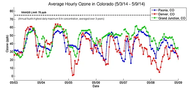 Ozone levels in three Colorado cities over a week.
Students build on their existing air quality knowledge and a description of a data set to each develop a hypothesis around how and why air pollutants vary on a daily and seasonal basis. Then they are guided by a worksheet through an Excel-based analysis of the data. This includes entering formulas to calculate statistics and creating plots of the data. As students complete each phase of the analysis, reflection questions guide their understanding of what new information the analysis reveals. At activity end, students evaluate their original hypotheses and “put all of the pieces together.” The activity includes one carbon dioxide worksheet/data set and one ozone worksheet/data set; providing students and/or instructors with a content option. The activity also serves as a good standalone introduction to using Excel.
On a daily basis, engineers rely on tools, such as the Microsoft® Excel® spreadsheet application. Typically, data sets are too large or it is too time consuming to conduct the analysis by hand. Similarly, engineers often need to apply concepts from other fields, such as mathematics, in order to move forward in their work. This activity provides students with the opportunity to practice both of these skills. Students must apply their existing scientific knowledge along with mathematic concepts (statistics), and utilize Excel to analyze, interpret and draw conclusions from a data set.
After this activity, students should be able to:
- Use Microsoft® Excel® for data analysis, including entering formulas and creating graphs.
- Define statistical terms and plot types.
- Use both scientific knowledge and supporting evidence (that is, statistics and plots) to explain observations related to a data set.
- Analyze and interpret data, maps, and models concerning the direct and indirect evidence produced by physical and chemical changes that water, air, gravity, and biological activity create
Grades 9-12
Do you agree with this alignment?
- CCSS.Math.Content.HSS-ID.A Summarize, represent, and interpret data on a single count or measurement variable
Grades 9-12
Do you agree with this alignment? - CCSS.Math.Content.HSS-ID.A.2 Use statistics appropriate to the shape of the data distribution to compare center (median, mean) and spread (interquartile range, standard deviation) of two or more different data sets.
Grades 9-12
Do you agree with this alignment? - CCSS.Math.Content.HSS-ID.B Summarize, represent, and interpret data on two categorical and quantitative variables
Grades 9-12
Do you agree with this alignment? - CCSS.Math.Content.HSS-ID.B.6 Represent data on two quantitative variables on a scatter plot, and describe how the variables are related.
Grades 9-12
Do you agree with this alignment? - CCSS.Math.Content.HSS-ID.B.6c Fit a linear function for a scatter plot that suggests a linear association.
Grades 9-12
Do you agree with this alignment? - CCSS.Math.Content.HSS-ID.C.9 Distinguish between correlation and causation.
Grades 9-12
Do you agree with this alignment?
- STEL-3J Connect technological progress to the advancement of other areas of knowledge and vice versa.
Grades 9-12
Do you agree with this alignment?
- SEP.1.9-12.2 Apply concepts of statistics and probability (including determining function fits to data, slope, intercept, and correlation coefficient for linear fits) to scientific and engineering questions and problems, using digital tools when feasible.
Grades 9-12
Do you agree with this alignment? - SEP.1.9-12.1 Analyze data using tools, technologies, and/or models (e.g., computational, mathematical) in order to make valid and reliable scientific claims or determine an optimal design solution.
Grades 9-12
Do you agree with this alignment?
Before the activity, each student needs:
Each student needs:
- computer with Microsoft® Excel® spreadsheet application; alternatively, use Google Sheets
- CO2 Activity Worksheet (PDF) OR O3 Activity Worksheet (PDF), and its respective accompanying data set, CO2 Case Study Data (XLSX) OR O3 Case Study Data (XLSX)
- Excel Reference Sheet (PDF)
- Vocabulary List (PDF)
- Connecting to the Big Picture Handout (PDF)
- Pre–Activity Reading (docx)
- Pre–Activity Reading (pdf)
- Pre–Activity Worksheet (docx)
- Pre–Activity Worksheet (pdf)
- Pre-Activity Worksheet Answer Key (docx)
- Pre-Activity Worksheet Answer Key (pdf)
- CO2 Activity Worksheet (docx)
- CO2 Activity Worksheet (pdf)
- CO2 Activity Worksheet Answer Key (docx)
- CO2 Case Study Data (xlsx)
- CO2 Case Study Data Answer Key (xlsx)
- O3 Activity Worksheet (docx)
- O3 Activity Worksheet (pdf)
- O3 Activity Worksheet Answer Key (docx)
- O3 Activity Worksheet Answer Key (pdf)
- O3 Case Study Data (xlsx)
- O3 Case Study Data Answer Key (xlsx)
- Excel Reference Sheet (docx)
- Excel Reference Sheet (pdf)
- Connecting to the Big Picture Handout (docx)
- Connecting to the Big Picture Handout (pdf)
- Connecting to the Big Picture Handout Answer Key (docx)
- Connecting to the Big Picture Handout Answer Key (pdf)
- Vocabulary List (docx)
- Vocabulary List (pdf)
- Vocabulary List Answer Key (docx)
- Vocabulary List Answer Key (pdf)
It is helpful if students are familiar with basic statistics such as mean, median, mode, range. The Pre-Activity Reading (PDF) provides an overview of these as well as some concepts that may be newer.
Prior experience with Microsoft® Excel® is not required, but makes a difference in how much time is required. If students have already used Excel, expect this activity to be completed in ~45 minutes, while if they have never used Excel, the activity may take more time and facilitation (~135 minutes).
Background information from the associated lesson, An Introduction to Air Quality Research, is extremely beneficial and enhances students learning during this activity; alternatively, this air quality background information could be obtained from a different source, such as a different lesson or reading.
(The following introduction is ideal for students who have never used a spreadsheet application before because it shows them the benefit of using a tool such as Excel. If students have used Excel before, this introduction is less effective, so adjust the introduction accordingly.)
(Once students are at their computers with the worksheets, direct them to open either data set in the spreadsheet application.)
Let’s apply what we have learned about air quality to a real-world data set. In front of you, you have four days of pollutant data from two different months along with time and date information and other environmental factors like temperature. Begin by calculating the average pollutant concentration for the first month. (At this point, expect students to realize that each month has 100 data points.)
Would anyone like to calculate this value by hand? If not, why? (Expect students to realize how long that would take! Next, walk them through this first calculation using the spreadsheet application.)
- Click on cell P8, and then type the following:
- An equals sign (which is how all formulas begin in Excel)
- The word, “average”
- A left parentheses
- Then either highlight the first month’s pollutant data OR enter D8:D104
- Close the parentheses and hit the “enter” or “return” key
- The formula associated with cell P8 should look like this = AVERAGE(D8:D104)
After having done this, that cell should display the calculated answer. (For CO2 = 437.1 ppm and for O3 = 37.1 ppb)
You’ve just seen the value of using tools to aid in your data analysis. Tools, such as Excel, enable engineers and scientists to work at a much faster pace and with much larger sets of data, pushing the boundaries of research and innovation. Next, work through the rest of the worksheet and refer to the Excel Reference Sheet (PDF) for help.
Background
This activity is intended to introduce students to a new tool that can aid them in their air quality research projects (if they are completing the subsequent AQ-IQ activities) and into the future as well. Particularly, if your students have never used Microsoft® Excel®, it is recommended that the teacher practice in advance all of the formulas and plots using the data sets so as to be able to nimbly demonstrate for students/groups who have difficulties. For more Excel practice, see the tutorials and resources listed in the Additional Multimedia Support section. The Pre-Activity Reading (PDF) also contains examples of plots and more detailed descriptions of certain concepts (such as R-squared and linear regression).
In terms of the science and engineering content, students are challenged to build on what they learned in the previous AQ-IQ lesson and activities. More information specifically on carbon dioxide (CO2) and ozone (O3) is provided below.
Carbon Dioxide Data Set
Combustion processes and biological respiration emit carbon dioxide. A major carbon sink (a natural environment capable of absorbing carbon dioxide from the atmosphere) is vegetation. Thus, in the winter, carbon dioxide levels tend to be higher because less active vegetation exists to remove it from the air. Additionally, in the winter, more carbon dioxide may be released due to increased home heating. This is especially important in valleys where winter-time temperature inversions are common, such as Paonia, CO, where this data was collected.
On a daily basis, we also see fluctuations in CO2 called “diurnal trends.” The Earth’s planetary boundary layer is an atmospheric layer that acts somewhat like a lid. (This atmospheric boundary layer is the lowest part of the Earth’s atmosphere, from the ground to the bottom of where cumulus clouds form, and its behavior is directly influenced by its contact with the planetary surface.) Due to atmospheric dynamics, the planetary boundary layer lowers at night and rises during the day. The result is higher CO2 concentrations at night and lower during the day. Imagine having a given concentration of something in a container, as the container shrinks, the concentration must increase. This is what happens in our atmosphere nightly. Even if students are not familiar with the concept of a boundary layer, expect them to observe in the data higher concentrations of CO2 at night and lower concentrations during the day; they may also mention temperature inversions as being important, which is also correct. The boundary layer’s fluctuations and temperature inversions have the same effect. However, temperature inversions are more localized and driven by meteorology, whereas the boundary layer fluctuations happen on a larger scale and occur year round.
The comparison between CO2 and temperature provides an opportunity to discuss “correlation vs. causation.” Expect students to notice a relationship between the two (that is, when it is colder, CO2 is higher); however, cold temperatures do not cause CO2 levels to rise; rather, CO2 increases at night, which is when temperatures tend to drop. Temperature and CO2 are correlated, but cold temperatures do not cause higher CO2. The relationship is likely stronger in the winter due to the added impact of temperature inversions.
Ozone Data Set
Ozone requires three “ingredients” to form: 1) NOx or nitrogen oxides, 2) VOCs or volatile organic compounds, and 3) sunlight. Ozone forms via a photochemical reaction and thus can only occur in the presence of sunlight, which is what drives ozone’s daily trends. In the morning, O3 begins to form, then it increases through the day, peaking in the afternoon, and then begins to decrease, dropping overnight. This requirement for sunlight also explains the seasonal trends. Sunlight is much more available and stronger in May than October; hence, more O3 forms, as evidenced by the higher daily peaks. These seasonal conditions are why we tend to see ozone alerts (for example, in Colorado) during the summer and not in the winter.
This data set provides another opportunity to discuss “correlation vs. causation.” A positive correlation exists between ozone and temperature, but the high temperatures are not causing the ozone levels to rise; rather, the higher temperatures and the high ozone levels are both products of a larger amount of available sunlight. Conversely, we see less ozone when it is cold because at night, without the sun, ozone cannot form and temperatures drop.
Before the Activity
- Make copies of the Pre-Activity Reading (PDF) and Pre-Activity Worksheet (PDF) and assign them as homework the night before the activity.
- Reserve the computers—enough for each student or small student groups.
- Make copies of the Excel Reference Sheet (PDF), Vocabulary List (PDF) and Connecting to the Big Picture Handout (PDF).
- Determine how you want students to access the worksheets and (Excel) data sets: CO2 Activity Worksheet (PDF) OR O3 Activity Worksheet (PDF), and its respective accompanying data set, CO2 Case Study Data (XLSX) OR O3 Case Study Data (XLSX). For example, print out the worksheets, download them together as a class from the Teach Engineering website or pre-load them in advance onto a class Google Drive.
- Also decide if you want the entire class to work on the same worksheet/data set, or give students the choice of picking one of the two options. Both options walk students through the same calculations and plots. The difference between the two is the air quality content, that is, the sources and sinks of each pollutant and how these impact seasonal and daily variation. You could also choose the one that is more useful for your students, OR have half the class work on CO2 and half work on O3 and then share their findings verbally.
- It is recommended that teachers review the Vocabulary List Answer Key (PDF) and use one of the data sets to practice the formulas, as well as the other activities covered in the worksheet.
With the Students
- With students at the computers, direct them to look at one worksheet and open its associated data set.
- Present the Introduction/Motivation content to the class.
- Remind students that their completed pre-activity readings and worksheets may be helpful. Also, hand out the Excel Reference Sheet (PDF) as another resource.
- Direct students to work through the worksheet questions in order.
- As students work, walk around the class and assist as needed. Figure 1 shows an example of what an in-progress Excel workbook looks like.
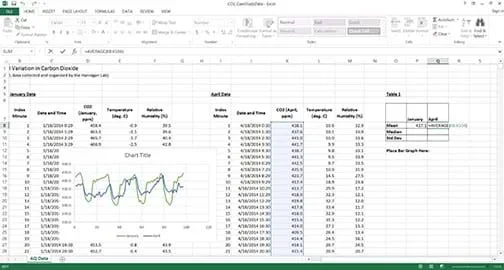 Figure 1. Example in-progress data set analysis using an Excel spreadsheet.
- As students complete the activity, discuss in small groups or as a class the following questions:
- Does the data support your hypotheses, or not? Why?
- What are your conclusions regarding daily and seasonal pollutant trends?
- What evidence in your data analyses supports these conclusions?
- What are your thoughts about using Excel?
- After the activity, assign students to complete the Connecting to the Big Picture Handout (PDF) or the Vocabulary List (PDF) as homework.
- coefficient of determination
- In statistics, a number that explains how well the data fits the model (such as a linear model). A value of 1 indicates a perfect fit, while a value of 0 indicates a poor fit. If data fits a model well, all of the points are close to the line or pattern; if the data is a poor fit, the points are far away or spread out from the line or pattern. (Refer to the example plots in the Pre-Activity Reading for a more detailed explanation.) Also called “R squared” and noted as R2.
- histogram
- A type of plot used to understand the distribution of a data set. All possible data points are plotted along the x-axis, and the y-axis is the frequency with which the points occur. Data is typically binned into columns so that a higher column indicates that values falling in the binned section occur more frequently.
- linear regression
- In statistics, a method by which a standard “y = m*x+b” model is fit to a data set to solve for the coefficients (m and b) that result in the best fit, or the line with the least distance to each data point. Used to explain relationships in data or predict future data. (See the example plots in the Pre-Activity Reading for a more detailed explanation.) Also called linear fit.
- mean
- The average number in a data set. The sum of every number in a data set divided by the number of points in that data set.
- median
- The middle number (or the average of the two middle numbers) after a data set has been arranged from least to greatest. Also: the 50th percentile.
- mode (statistics)
- The most frequently occurring number in a data set.
- population
- The entire pool from which a sample is drawn (every possible data point).
- range (statistics)
- The difference between the largest and smallest values in a data set.
- sample (statistics)
- A reasonable selected subset of a population. Samples are used when it is unreasonable to measure an entire population.
- scatter plot
- A graph that enables the examination of the relationships between variables. Each variable is plotted on an axis, and patterns or fitted models suggest relationships in the data.
- standard deviation
- standard deviation In statistics, the variance in the data, or how “spread out” the data is.
- time series plot
- A graph with time on the x-axis and values of interest on the y-axis that is used to evaluate patterns and behavior in data over time. Useful for examining temporal trends (or trends in time).
Pre-Activity Assessment
Reading-Worksheet Assignment: The night before the activity, assign students to use the Pre-Activity Reading (PDF) to complete the Pre-Activity Worksheet (PDF). The reading includes information about basic statistics, data visualization techniques and data interpretation. The worksheet includes a problem set that is intended to help students apply what they learn in the reading. Review their worksheets to see if they are ready for the activity or if any topics need more explanation.
Activity Embedded Assessment
Worksheet: The bulk of this activity is students individually working through a worksheet (CO2 Activity Worksheet (PDF) or O3 Activity Worksheet (PDF)) with the intent to cultivate their familiarity with data analysis using Excel. While each student is responsible to complete his/her own worksheet, encourage discussion and collaboration, especially if Excel is new to most students. Review their worksheets to gauge their depth of comprehension.
Post-Activity Assessment
Connecting to the Big Picture: Assign as homework the Connecting to the Big Picture Handout (PDF), which is a set of open-ended questions that asks students to apply their knowledge of air quality acquired thus far in the unit to the local community. This exercise also aids students in thinking of potential topics for their upcoming projects. If possible, take time to discuss their answers during the following class periods.
Vocab List: Assign as homework the Vocabulary List (PDF), which is a list of statistics and data analysis concepts. By the end of the activity, expect students to be able identify and define these terms. Use this handout to assess how much new information students retained.
Getting started with Excel: Introduction to Excel Starter: https://support.microsoft.com/en-us/office/introduction-to-excel-starter-601794a9-b73d-4d04-b2d4-eed4c40f98be?ui=en-us&rs=en-us&ad=us
Help on specific concepts: Excel Easy (Tutorial): https://www.excel-easy.com/
Excel videos and tutorials for specific tasks: https://support.microsoft.com/en-us/office/excel-2013-training-aaae974d-3f47-41d9-895e-97a71c2e8a4a?ui=en-us&rs=en-us&ad=us
Note: This activity does not require the use of a Pod.
Sources of Greenhouse Gas Emissions. Last updated May 26, 2016. Climate Change, U.S. Environmental Protection Agency. Accessed July 21, 2016. https://www3.epa.gov/climatechange/ghgemissions/sources.html
Contributors
Ashley Collier; Katya Hafich; Daniel Knight; Michael Hannigan; Joanna Gordon; Ben Graves; Eric Ambos; Olivia Cecil; Victoria Danner; Erik Hotaling; Eric Lee; Drew Meyers; Hanadi Adel Salamah; Nicholas VanderKolk
Supporting Program
AirWaterGas SNR Project Education and Outreach, College of Engineering, University of Colorado Boulder
Acknowledgements
This material is based upon work by the AirWaterGas Sustainability Research Network Education and Outreach Project in the College of Engineering at the University of Colorado Boulder, supported by National Science Foundation grant no. CBET 1240584. However, these contents do not necessarily represent the policies of the National Science Foundation, and you should not assume endorsement by the federal government.
The authors also express their appreciation for the support of the University of Colorado’s Office of Outreach and Engagement.
Copyright
2013 by Regents of the University of Colorado