
Where Are the Plastics Near Me? (Mapping the Data)
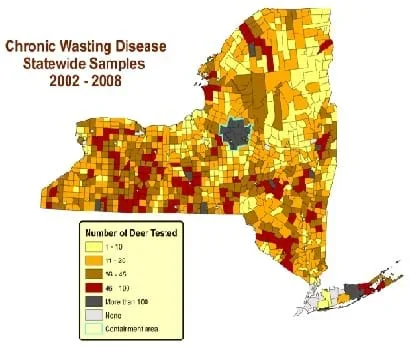 Distribution of deer sampled for chronic wasting disease in New York, 2002-2008. This is an example of field data plotting with data linked to spatial areas on a map, no different in concept from plotting the locations of plastic debris that are sampled by students in this activity. Student maps will be even more useful because they are interactive.Copyright New York State Department of Environmental Conservation via usa.gov {PD} http://www.dec.ny.gov/animals/33220.html
In a student-led and fairly independent fashion, data collected in the associated field trip activity are organized by student groups to create useful and informative Google Earth maps. Each team creates a map, uses that map to analyze the results, adjusts the map to include the analysis results, and then writes a brief summary of findings. Primarily, questions of fate-and-transport of plastics are are explored. If data was gathered in the field trip but the teacher does not desire to do the mapping activity, then alternative data presentation and analysis methods are suggested.
Water resources, environmental and civil engineers are often presented with volumes of field information that must be organized without creating error, presented well and analyzed. This activity asks students to do all these tasks as they design a presentation scheme that best fits what they discover in their data. They experience the iterative nature of design—the cycle of analysis, presentation and evaluation.
After this activity, students should be able to:
- Sort through a sizeable amount of data to determine what is significant.
- Organize field-based information.
- Mix field information with external sources of information.
- Present scientific and engineering findings visually and with text.
- Understand the iterative design process involved in data analysis and presentation.
- CCSS.Math.Practice.MP5 Use appropriate tools strategically.
Grades K-12
Do you agree with this alignment?
- The management of waste produced by technological systems is an important societal issue.
Grades 6-8
Do you agree with this alignment? - STEL-4L Analyze how the creation and use of technologies consumes renewable and non-renewable resources and creates waste.
Grades 6-8
Do you agree with this alignment? - STEL-8J Use devices to control technological systems.
Grades 6-8
Do you agree with this alignment?
- MS-ESS3-4 Construct an argument supported by evidence for how increases in human population and per-capita consumption of natural resources impact Earth's systems.
Grades 6-8
This resource focuses on the following Three Dimensional Learning aspects of NGSS:
Science & Engineering Practices- Conduct an investigation to produce data to serve as the basis for evidence that meet the goals of an investigation.Do you agree with this alignment?
- Analyze and interpret data to provide evidence for phenomena.Do you agree with this alignment?
Disciplinary Core Ideas- Typically as human populations and per-capita consumption of natural resources increase, so do the negative impacts on Earth unless the activities and technologies involved are engineered otherwise.Do you agree with this alignment?
Crosscutting Concepts- All human activity draws on natural resources and has both short and long-term consequences, positive as well as negative, for the health of people and the natural environment.Do you agree with this alignment?
- Technologies extend the measurement, exploration, modeling, and computational capacity of scientific investigations.Do you agree with this alignment?
Do you agree with this alignment? - Conduct an investigation to produce data to serve as the basis for evidence that meet the goals of an investigation.
- 6.1.C select tools, including real objects, manipulatives, paper and pencil, and technology as appropriate, and techniques, including mental math, estimation, and number sense as appropriate, to solve problems;
Grade 6
Do you agree with this alignment?
- Earth and space. The student knows that natural events and human activity can impact Earth systems. The student is expected to:
Grade 7
Do you agree with this alignment? - analyze data to formulate reasonable explanations, communicate valid conclusions supported by the data, and predict trends.
Grades 6-8
Do you agree with this alignment?
Each group needs:
- field notebook pages from the Where are the Plastics Near Me? (Field Trip) activity
- Turning Your Spreadsheet into a Google Earth Layer Instructions (PDF); students will not be re-creating the cryptids map descibed on this handout (part of a different activity in this unit), but they will use a similar procedure to convert data to a Google Earth Layer, the only difference is what data is being converted
This activity is a continuation of the Where Are the Plastics Near Me? (Field Trip) activity. The field trip activity must be conducted in some form to do this data mapping activity though the data from the field trip does not have to be used for the data mapping.
The Mapping the Data activity is also meant to be conducted after the Searching for Bigfoot and Others Like Him activity has been completed by students. Taken in view of the entire Digital Mapping and Geographic Information Systems (GIS) unit, the Mapping the Data activity requires most of the skills and knowledge that students will have gained through lessons 1-3 and their associated activities.
Treat this activity as an open-ended project for students to design rather than a step-by-step prescriptive procedure, as is often given in computer technology-based assignments. Students have already learned most skills that they need to turn the plastics field trip data into an interesting map; they simply need to decide what spatial data locations to use and what pieces of data to use for each location. If the field trip activity was conducted as suggested, the following pieces of information will exist for every photo location:
- 1-3 photographs
- Photograph IDs
- Direction photographs taken
- Description of photographs
- WGS84 lat-long coordinates (decimal degree format)
- Dimensions of plastic trash in photographs
- Photograph location distances of camera-to-photograph object
Give each group a copy of the field notebook (hard copy or digital) and a digital copy of the photographs. In general, they need to accomplish the following steps for any kind of map that they choose to make: select the data to be used, key and error check the field data, organize data into a spreadsheet, publish selected photographs online, gather useful links for each location, provide commentary on the photographs, place all information into the online Google Mapper Spreadsheet, run the map, troubleshoot the map until no more errors appear in the display, analyze what is seen in the map, add that analysis to the next generation of the map, and write a brief summary of the findings from the analysis.
Before the Activity
- Check the field notes (from the associated Field Trip activity) for obvious errors and have students who recorded those notes fix them in some reasonable way.
- Make copies of the field notes and the Google Earth layer instructions, one each per group.
- Provide a way for student groups to have access to all photos.
- Provide a place on a computer or server for each student group to save all files related to their projects.
With the Students
- Decide what locations to use and what photographs at those locations to use. Generally, only use photographs that have a complete coordinates. Make all photographs and locations by all teams available to everyone. A good map should have ~20-25 separate locations, some of which will be located very close to each other if they are at the same site; when zoomed, they will be distinct.
- Place those locations in an Microsoft Excel spreadsheet.
- Type all field-based descriptions, coordinates and other quantitative information (distance, heading, lengths) into the Excel table.
- Check coordinates and headings for accuracy. Type coordinates into Google Earth to see if they make sense. If they do not make sense, use the memory of the field crew and descriptions to make good guesses as to where they should be. Extract the coordinate from Google Earth using the same procedure as in the Searching for Bigfoot and Others Like Him activity. For the headings, use the aerial photo to see if the heading given is plausible and correct it when obviously mistaken. For example, if the picture shows a bridge, but the heading given is the reverse direction from the bridge, the written heading is probably inaccurate.
- Place photographs online so that they can easily be accessed by Google Earth. Google's Picasa tool works well for this since students need a Google account to run the Google Spreadsheet Mapper tool anyway. Alternate online tools for this are https://www.flickr.com and http://www.photobucket.com/. Once pictures are online, provide the geospatial spreadsheet with a separate link for every photo used in the final product.
- Load the Excel data into Google Spreadsheet Mapper, as shown in the Searching for Bigfoot and Others Like Him activity. Then view the data in Google Earth.
- Once all their data and photos are displaying correctly, direct students to do a little more analysis. For every location, they need to include a brief analysis about the location that answers one or more of the following questions in a few sentences. Be sure that they JUSTIFY their answers using the collected data (plastic type, description, size, location within the flood plain or closeness to river, perceived weight of the object, etc.)
- How do you think that this plastic ended up at this location?
- What kind of environmental risk does this debris pose to the local environment (plants, animals, people, water or soil contamination, might it grow harmful pathogens)?
- What do you believe about the degradation potential of this plastic or other material? Take into account the location, observed current state of degradation of the plastic, and where you think that the plastic might go in the the future.
- What do you believe will ultimately happen to this plastic?
- What does this plastic indicate about the general level of plastic or trash contamination at this site? What about in this general area of the watershed?
- How likely is it that this material will end up in the GPGP? Take into account the material weight (will it float or sink) and its durability (will it really last on a journey of thousands of miles)?
- When one or more of these questions has been answered in the Excel spreadsheet, then generate the map and check it for display errors. Continue the redesign as an iterative process. If something interesting was discovered answering the analysis questions, would it make more sense to change some of the links that you have? If you think that some of this plastic you found might be bioplastic, change your original weblink to something about bioplastics. If your analysis reveals that this site might be a gathering zone for plastics while another site might not be, then add some more lines in your spreadsheet (thus more map points) to illustrate just how many plastics were found there. This further justifies the conclusions and the findings that you are seeing. Continue changing the map in this fashion until all of the questions are exhausted.
- Write a half to full page summary of the analysis and conclusions in 12-point font. Include one figure that is a screen shot of your map. Pick the best one because you can only have one. The figure CANNOT be part of the analysis summary; the half to full page summary must be text only.
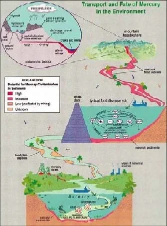 Fate and transport conceptualization of mercury in the environment. Similar thinking and analysis is being asked of students with regards to plastics.Copyright U.S. Geological Survey {PD} http://minerals.er.usgs.gov/west/capabilities.htm
- great pacific garbage patch
- A mass of floating debris, mostly plastic, in the Northwest Pacific Ocean that spins around a central point. It is hundreds to thousands of miles long, floats just below the surface, and extends to a depth of about 10 meters.
- environmental fate-and-transport
- Refers mainly to environmental contamination by biological (bacteria viruses), chemical (pesticides, metals, nutrients), or physical (trash, sediment) means. Fate and transport is concerned with the question of how is the contamination moving and going to move in an environment (transport) and where will it ultimately go or be transformed into (fate).
- qualitative data
- Data of a descriptive or categorical nature. Examples: Sensations such as salty/sweet in taste or male/female.
- quantitative data
- Data expressed as some form of numerical quantity.
- easting
- Refers to UTM and other similar coordinate systems (such as State Plane). The measurements in the system that are east and west.
- northing
- Refers to UTM and other similar coordinate systems (such as State Plane). The measurements in the system that are north and south.
- world geodetic system 1984
- A standard coordinate system that uses the 1996 Earth Gravitational Model geoid and is referenced to the center of the Earth. Coordinates are given as latitude and longitude though the "prime meridian" used is slightly different from the classic Prime Meridian through Grenwich. Abbreviated as WGS84.
Activity Embedded Assessment
Discussion: Engage students often during the design process to see how well their projects are going and to make sure they are giving the analysis questions especially the depth of thought that is required.
Post-Activity Assessment
Interactive Layer and Summary Report: Examine the maps interactively and the summaries that student groups have written to see if they understood what they were doing and if they found useful and interesting ways to organize and present the data.
Alternative Data Presentations: If the teacher for any reason does not want to spend class time getting the students prepared to make their own map layers (especially true if the Searching for Bigfoot and Others Like Him activity cannot be fit into the class schedule), the plastics data from the field trip can still be used as an interesting report that includes the images as figures or as a Microsoft PowerPoint slideshow. Geospatial analysis can still be done to a degree as well. Students would simply consider the locations in Google Earth by entering coordinates in the search bar. The locations could even be temporarily marked and labeled using the yellow pushpin placemarker tool of Google Earth.
Since this activity is very open-ended, scaling could be easily done by limiting the number of requirements students must complete or by the teacher completing some of the data processing steps so that the entire class does not have to do them.
Show students some examples of how spreadsheet data is mapped by showing them this video created by Google for demonstration of the program: https://www.youtube.com/watch?v=DjKrsN66Udw
David Tryse created some very interesting map layers, which are far more advanced than what students will likely be able to create, but they are readily downloadable and can stimulate more ideas and excitement for creating Google Earth layers. The map content relates to environment and has much good information to teach about environment in a geospatial way even without students thinking about how the maps are actually made. See http://david.tryse.net/googleearth/#KML_files
- Digital Mapping and Geographic Information Systems (GIS)
Contributors
Nathan Howell; Andrey Koptelov
Supporting Program
National Science Foundation GK-12 and Research Experience for Teachers (RET) Programs, University of Houston
Acknowledgements
This digital library content was developed by the University of Houston's College of Engineering under National Science Foundation GK-12 grant number DGE 0840889. However, these contents do not necessarily represent the policies of the NSF and you should not assume endorsement by the federal government.
Copyright
2013 by Regents of the University of Colorado; original © 2010 University of Houston