
Quick Look
Grade Level: 4 (3-5)
Time Required: 45 minutes
Lesson Dependency: None
Subject Areas: Data Analysis and Probability, Measurement, Science and Technology
Quick Look
- Grade Level:
- 4 (3 – 5)
- Time Required:
- 45 minutes
- Subject Areas:
-
Data Analysis and Probability Measurement Science and Technology

Summary
Students analyze cellphone signal data from a high-altitude balloon launch, testing how the strength of the cell signal changes with altitude. Students begin by looking at graphs and discussing the various components, as well as different types of graphs. Students then have the opportunity to practice collecting, plotting and analyzing data. Finally, students apply their graph interpretation skills to investigate actual data collected from a 2020 balloon launch to determine how the strength of the cell signal changes with altitude.Engineering Connection
Engineers are constantly evaluating models and data to determine whether their design is performing its specified purpose. During the testing stage of the engineering design process, they must revisit data, repeat steps, and question the accuracy and purpose of their results and implications. By devoting constant attention to reevaluation and redesign, engineers move closer to a best final product.
Learning Objectives
After this lesson, students should be able to:
- Analyze data based on a given question.
- Graph collected data in an appropriate form.
- Question and test the accuracy of collected data.
Educational Standards
Each Teach Engineering lesson or activity is correlated to one or more K-12 science,
technology, engineering or math (STEM) educational standards.
All 100,000+ K-12 STEM standards covered in Teach Engineering are collected, maintained and packaged by the Achievement Standards Network (ASN),
a project of D2L (www.achievementstandards.org).
In the ASN, standards are hierarchically structured: first by source; e.g., by state; within source by type; e.g., science or mathematics;
within type by subtype, then by grade, etc.
Each Teach Engineering lesson or activity is correlated to one or more K-12 science, technology, engineering or math (STEM) educational standards.
All 100,000+ K-12 STEM standards covered in Teach Engineering are collected, maintained and packaged by the Achievement Standards Network (ASN), a project of D2L (www.achievementstandards.org).
In the ASN, standards are hierarchically structured: first by source; e.g., by state; within source by type; e.g., science or mathematics; within type by subtype, then by grade, etc.
NGSS: Next Generation Science Standards - Science
-
SEP.1.3-5.2.
Represent data in tables and various graphical displays (bar graphs and pictographs) to reveal patterns that indicate relationships.
(Grade 3)
More Details
Do you agree with this alignment?
Common Core State Standards - Math
-
Model with mathematics.
(Grades
K -
12)
More Details
Do you agree with this alignment?
-
Draw a scaled picture graph and a scaled bar graph to represent a data set with several categories. Solve one- and two-step "how many more" and "how many less" problems using information presented in scaled bar graphs.
(Grade
3)
More Details
Do you agree with this alignment?
-
Graph points on the coordinate plane to solve real-world and mathematical problems.
(Grade
5)
More Details
Do you agree with this alignment?
-
Represent real world and mathematical problems by graphing points in the first quadrant of the coordinate plane, and interpret coordinate values of points in the context of the situation.
(Grade
5)
More Details
Do you agree with this alignment?
Worksheets and Attachments
Visit [www.teachengineering.org/lessons/view/uow-2675-cell-signal-altitude-testing-strength-lesson] to print or download.Pre-Req Knowledge
Students should have a cursory knowledge of graphs and interpreting data. (Note: Interpreting the graph aims for Common Core Math Standards for 6th grade, including a measure of center. However, students do not need to calculate the center (average) in this lesson; rather they should understand the application of “center.”)
Introduction/Motivation
Many of us use cellphones every day. Do you know how a cellphone works? Cellphones rely on electromagnetic signals coming from cellphone towers. These signals allow us to use our phones to make calls and browse the internet. Sometimes these signals are very strong and other times they are weak. We can tell how strong the signal is by checking to see how many bars of service the phone is receiving. What kinds of things make a cell signal weak? There are many factors that can affect cellphone signal strength, such as terrain (like mountains), weather, and distance from the cellphone tower. For example, the farther your phone is from the nearest tower, the weaker the signal will be.
Now, most of us usually do not think about how cellphone towers transmit signal that reaches our cellphones. We just want our cellphones to have enough signal to work! But let’s think about this for a moment. We know cell towers transmit signal to our cellphones and we know that the farther your phone is from the nearest tower, the weaker the signal will be. So, we know that cellphones can pick up these signals close to the ground. But what about higher in the atmosphere? Can a cellphone pick up a signal on a high mountaintop? What about at 30,000 feet, where jet airplanes fly? What about in the ozone layer within the stratosphere, more than 10 miles above our heads? Are cell phone signals limited to the surface where people can use them? Let’s investigate this issue.
In this lesson, we will be analyzing cellphone signal data that were collected from a high-altitude weather balloon that ascended high into the atmosphere. This balloon was launched from Casper, Wyoming, in the fall of 2020 by a group of college students from the University of Wyoming. They used special electronics and sensors attached to the balloon to continuously measure the strength of cellphone signals coming only from cell towers on the ground. These sensors were powered by batteries and connected with wires to a small computer. The strength of the signal was measured in a unit called dBm; the higher the dBm, the stronger the signal. A good cellphone signal has a strength of around –70 dBm or larger. A very poor cellphone signal has a strength of less than –100 dBm. Below about –110 dBm, the signal is lost altogether. This is what happens when our cellphones tell us that there is no signal.
We are going to investigate is how the strength of a cell signal changes at different altitudes and what that might mean about how the signal is transmitted from towers. Think about what elements, either natural or man-made, can affect these changes. We can use the things learned here to discuss how cellphone towers work and how electromagnetic radiation, such as a cellular signal, moves through our atmosphere.
Lesson Background and Concepts for Teachers
There are three types of graphs students need to know for this lesson: bar graphs, line graphs, and pie charts.
- Bar graph: A graph in the form of boxes of different heights, with each box representing a different value or category of data, and the heights representing frequencies.
- Line graph: A graph in which a series of connected straight lines connect points, each of which represents the value of a particular variable.
- Pie Chart: A pictorial graph in the shape of a circle, with segments representing related proportions. Pie charts show the distribution of the components of one phenomenon.
The graph shown in slide 10 of the Analyzing Data PowerPoint (and shown in Figure 1 below) is a line graph. This type of graph best illustrates the changes in cellphone signal with altitude. Students will need to decide which variables go on each axis. Although the graph in Figure 1 has altitude on the x-axis, it is sometimes more helpful to put altitude on the y-axis to reflect the fact that altitude changes in the vertical.

Students are presented with the following questions:
- How do you think the cellular signal will change higher in the atmosphere, farther from the cellphone towers on the ground?
- Do you think the signal will change gradually with altitude or abruptly?
- What things could be causing these changes in the signal?
Students create an appropriate graph of the provided data that were collected during a high-altitude weather balloon flight over Casper, Wyoming, on a clear day in the fall of 2020. These data are provided as a CSV file that can be opened and graphed within Microsoft Excel. There are two columns of data that the students will use: altitude (ft) and RSSI (dBm). RSSI simply stands for Received Signal Strength Indicator and it is the measurement of cellphone signal strength obtained by the electronic sensors that were flying with the balloon. The altitude is in feet above sea level and starts at just over 5,200 feet, the ground elevation of Casper, Wyoming.
During this lesson, students will discover the limitations of the data (i.e., it is often messy and noisy) and may realize that their questions need to be refined or restated. The primary discovery will be that the signal strength decreases gradually from the ground (5,240 feet) up to about 10,000 feet. Above that altitude, the strength of the signal remains quite poor (below about –90 dBm) all the way up to almost 100,000 feet, which is into the ozone layer within the stratosphere.
Astute students may notice that even at high altitudes the strength still fluctuates quite a bit between –90 dBm (poor signal) and –115 dBm (no signal). In other words, the signal never completely disappears for good. One possible reason for this is sensor error which could produce “ghost” signals, especially when the real signal is very weak or nonexistent. Another possible explanation is that the antenna used to capture the incoming signal was constantly changing direction as the balloon moved through the atmosphere. When the antenna was angled downward, it could pick up a weak signal. When it was angled upward, it measured no signal at all. Regardless of the possible reasons for these fluctuations, students should still be able to see that as the sensors move higher in the atmosphere, the signals they measured from the towers on the ground weakened.
Following this discovery, it may be worth having the students search online for more information about how cellphone towers work, specifically the direction in which cell towers transmit their signals and how far their signals will travel (i.e., the range) before they become too attenuated by the atmosphere to be useable. Since almost all cellphone users are situated on the ground, cell towers tend to transmit their signals horizontally, although it is possible that some towers transmit in all directions (i.e., isotropically). Thus, it would not be all that surprising that cellphone signals decrease with altitude. Many signals can travel up to 100 km (60 miles) or more before they become completely attenuated by the atmosphere, so range does not seem to be the primary factor for why the signal decreased as much as it did up to 100,000 feet (only ~18 miles above the ground). Other elements such as weather (especially precipitation), hills and mountains, and even buildings can decrease their range. Since none of these were present between the balloon and cell towers on the day of this flight, it is likely that the signal decreased primarily because most cell towers do not transmit their signals very far in the upward vertical direction.
Associated Activities
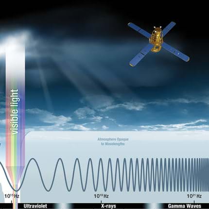
- Electromagnetic Waves Are Everywhere! - Students discover the different of uses of electromagnetic radiation by learning about devices that use electromagnetic waves such as laser pointers, remote controls, and X-ray machines. Students conduct basic research into each of these devices to determine which use higher and lower frequencies of the electromagnetic spectrum. Students become researchers, using problem-solving and creative thinking to determine how these devices use electromagnetic radiation to operate. Students practice writing about science, engineering, and technology. Students then become experts on one electromagnetic radiation device and practice their research skills to create a poster presentation.
Lesson Closure
Today, we practiced our data analysis skills. We graphed the weather balloon data and got to practice thinking like scientists and engineers. We questioned our results and asked how they could be better.
Today, we learned what elements, natural or human-made, can impede cellphone signal and how this could possibly affect our data. We learned that a group of college students designed and built electronics to attach to a high-altitude balloon and collect data about the strength of cellphone signals. We examined their data to draw inferences and better understand how cellphone towers work and how they transmit their signals.
Vocabulary/Definitions
bar graph: A graph in the form of boxes of different heights, with each box representing a different value or category of data, and the heights representing frequencies.
data: Information, especially in a scientific or computational context, or with the implication that it is organized.
graph: A data chart (graphical representation of data) intended to illustrate the relationship between a set (or sets) of numbers (quantities, measurements or indicative numbers) and a reference set.
line graph: A graph in which a series of connected straight lines connect points, each of which represents the value of a particular variable.
pie chart: A pictorial graph in the shape of a circle, with segments representing related proportions.
x-axis: The axis on a graph that is usually drawn left to right and usually shows the range of values of an independent variable.
y-axis: The axis on a graph that is usually drawn from bottom to top and usually shows the range of values of variables dependent on one other variable, or the second of two independent variables.
Assessment
Pre-Lesson Assessment
Brain Dump: Ask students to list what they know about graphs and collecting data.
Lesson Embedded (Formative) Assessment
Excel graphs of data: While students are creating their data sets and graphs, ask what categories they are making and why. Additionally, ask if there is anything that their graphs make them question or wonder about the data.
Post-Lesson (Summative) Assessment
Class discussion of results: After completing their graphs and discussing what the data showed, ask the students what might explain the changes in cellphone signal at higher altitudes. Also ask the students how they might apply this knowledge to their everyday lives using cellphones.
Subscribe
Get the inside scoop on all things Teach Engineering such as new site features, curriculum updates, video releases, and more by signing up for our newsletter!More Curriculum Like This

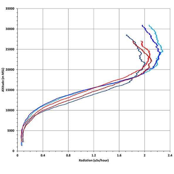
Students analyze radiation data collected from a balloon launched into near space to see if their designed cosmic radiation shielding worked. Students should explain their findings, which might require some research to show if this observation is correct and why. This includes a comparison of the s...
Through role playing and problem solving, this lesson sets the stage for a friendly competition between groups to design and build a shielding device to protect humans traveling in space. The instructor asks students—how might we design radiation shielding for space travel?
Filtering is the process of removing or separating the unwanted part of a mixture. In signal processing, filtering is specifically used to remove or extract part of a signal, and this can be accomplished using an analog circuit or a digital device (such as a computer). In this lesson, students learn...

Learn the basics of the analysis of forces engineers perform at the truss joints to calculate the strength of a truss bridge known as the “method of joints.” Find the tensions and compressions to solve systems of linear equations where the size depends on the number of elements and nodes in the trus...
References
Wilsonpro. Top 5 Surprising Things that Block Your Cell Signal. Posted January 3, 2020. WILSONPRO. https://www.wilsonpro.com/blog/top-5-surprising-things-that-block-your-cell-signal
Copyright
© 2023 by Regents of the University of Colorado; original © 2020 University of WyomingContributors
Kelsy Begin, Abigail Fearneyhough, Connor Hamp, Trina Kilty, Philip Bergmaier, Kevin Kilty, Shawna McBride, Kate Muir Welsh, Andrea Burrows, Jennifer WistisenSupporting Program
LIFT Project: Combining Project-based Learning, Citizen Science, and Authentic Research to Enhance the Success of STEM and STEM Education Majors, University of WyomingAcknowledgements
This material was developed based upon work supported by the National Science Foundation under grant no. 1821566—the LIFT (Learning to Integrate Fundamentals through Teaching) Project, Wyoming NASA Space Grant Consortium, University of Wyoming. Any opinions, findings and conclusions or recommendations expressed in this material are those of the authors and do not necessarily reflect the views of the National Science Foundation.
Last modified: March 15, 2023
User Comments & Tips